Vitapur: ecommerce storefront
Home, category and product pages for a Slovenian home goods store, on desktop and mobile. Their developers built it, and it's live.
- Role
- Solo Designer
- Client
- Vitapur Home goods
- Pages
- 3 Desktop and mobile
- Status
- Live Built by developers

The brief
Vitapur sells bedding, cookware and home goods across Slovenia, online and in its own stores. The store needed the three pages that carry most of the shopping: the home page, a category and a product.
The range is wide, from pillows to air fryers, and it is always on offer somewhere. The design had to make a busy catalogue feel calm and keep the deals easy to spot.
A home page built around offers
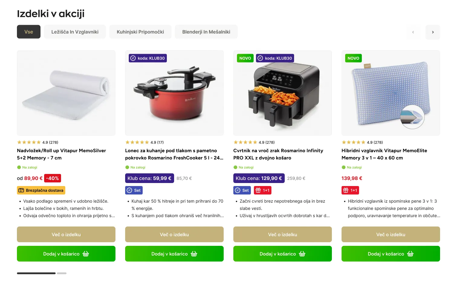
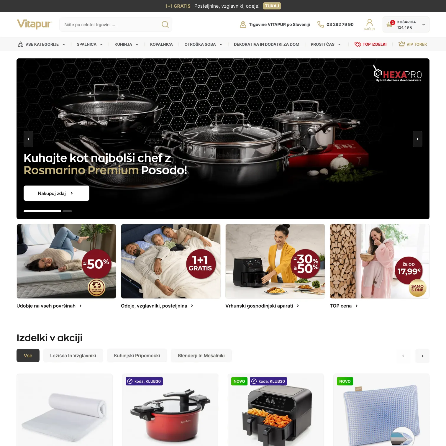
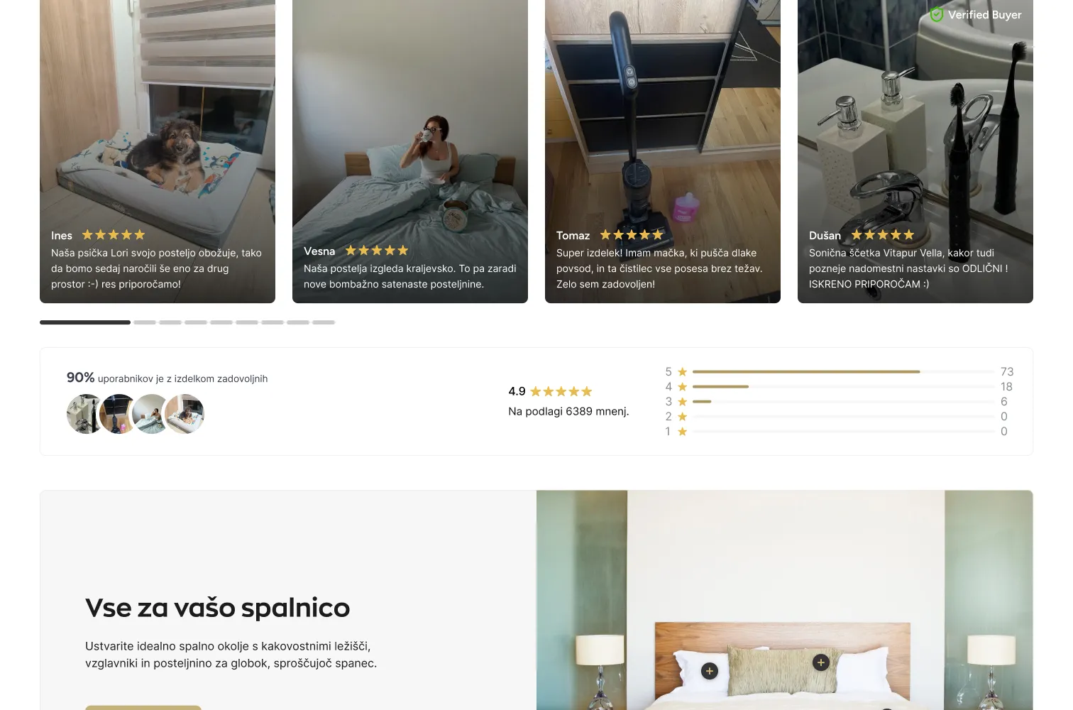
The home page opens with one campaign, then goes straight to shopping: categories with their current discount, the products on offer this week, and reviews from real customers further down. Prices and discount badges carry the colour, and the rest of the page stays quiet.
Category and product
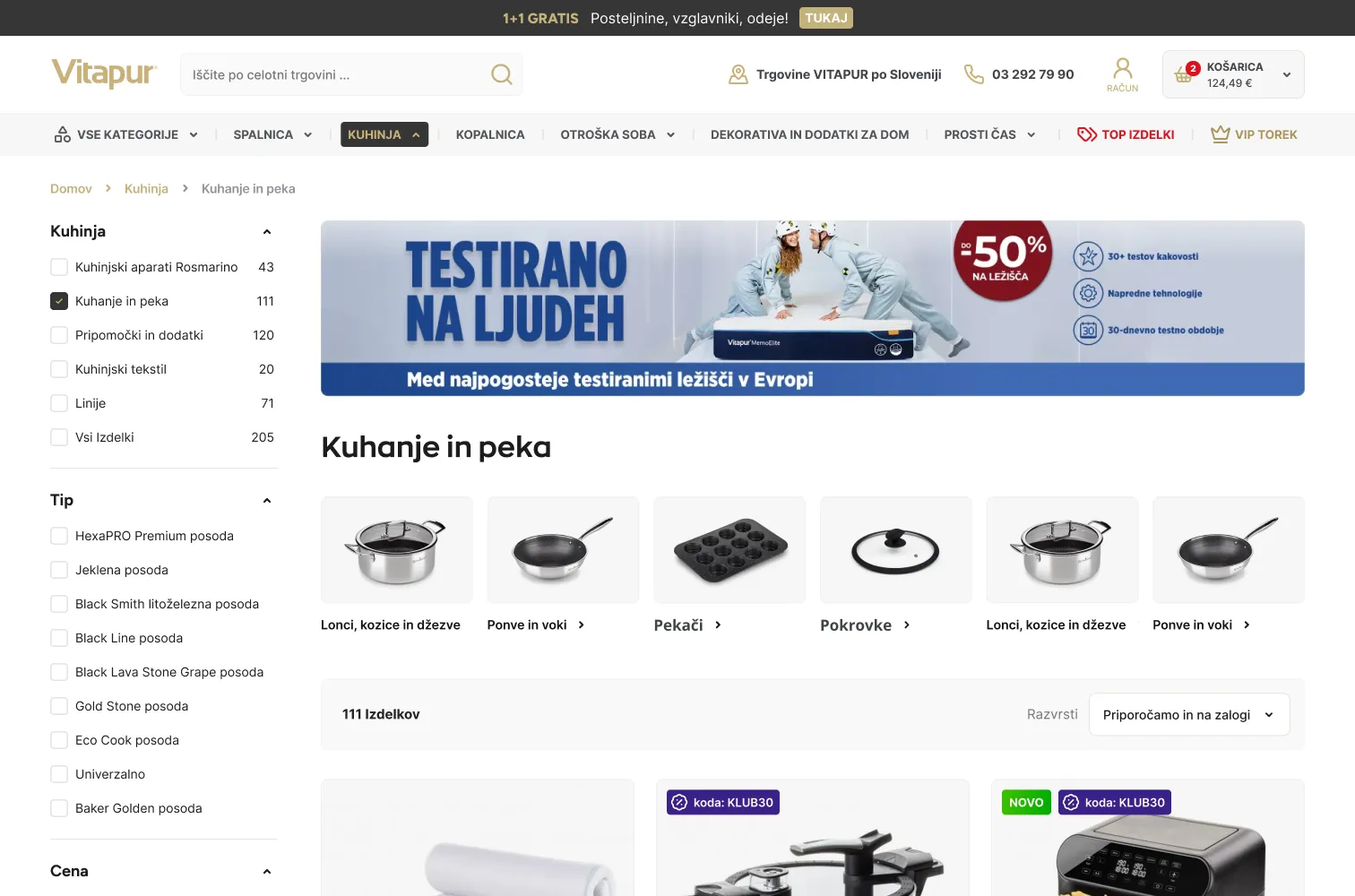
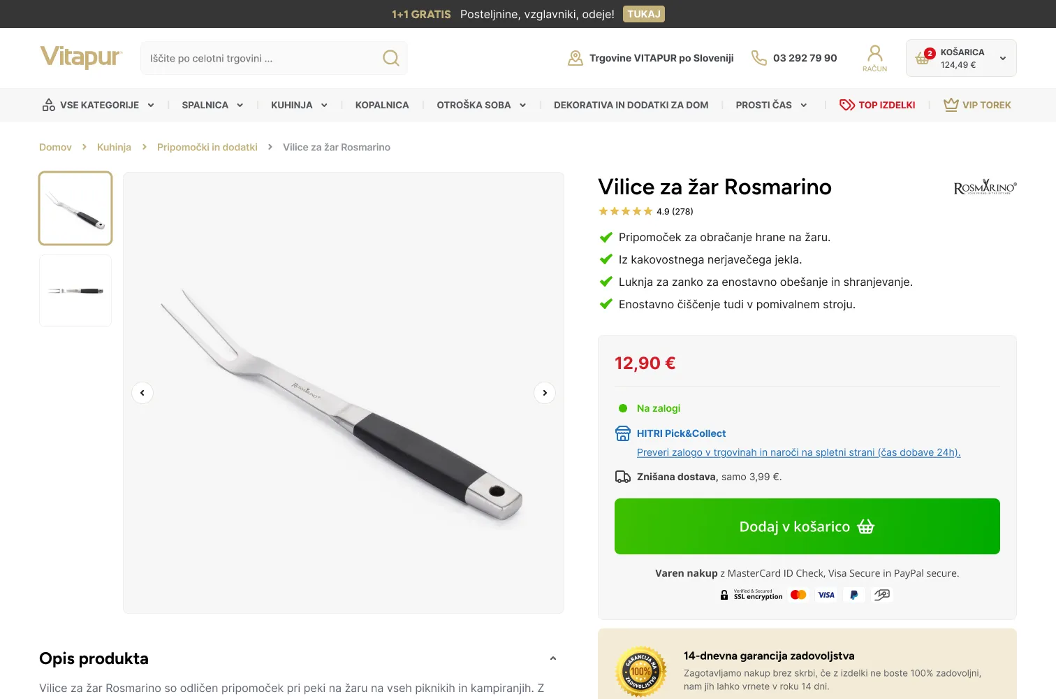
The category page keeps the filters on the left and a campaign banner above the grid, so a sale stays visible while you browse. The product page puts the price, the rating and the add to cart button next to the photos, with the key details right under them.
On the phone
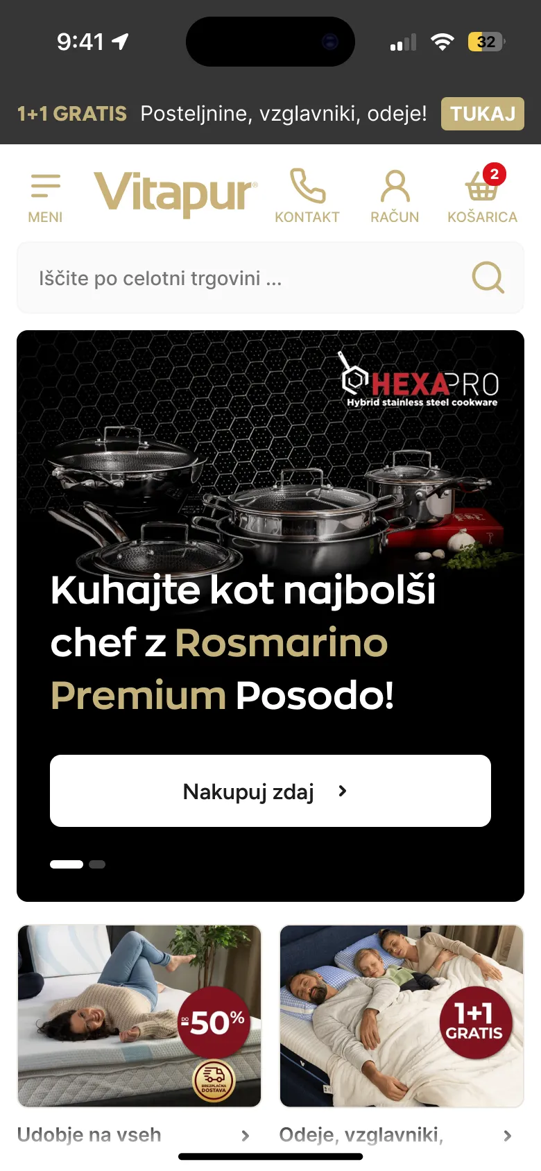
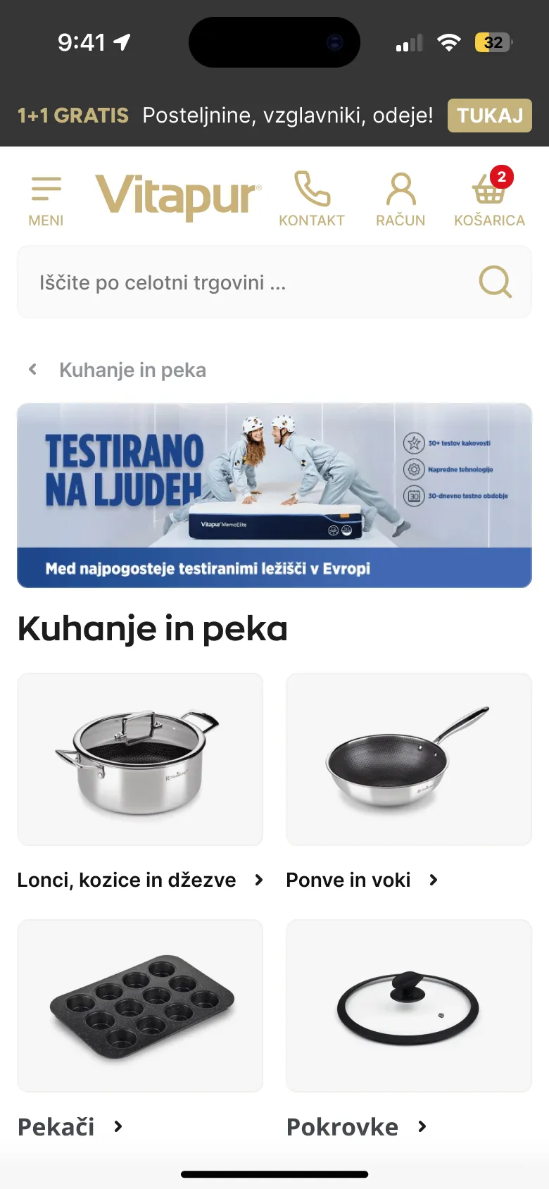
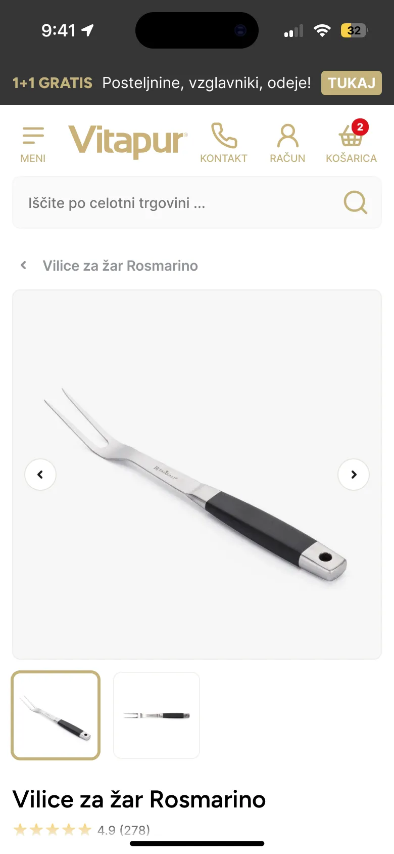
On mobile the header keeps the menu, contact, account and cart as four clear icons, the search sits right under them, and every page fits a thumb.
- Client
Brief
The three pages that carry most of the shopping, and the offers that change every week.
- Design
Desktop
Home, category and product on one grid and one set of components.
- Design
Mobile
A mobile version of each page, header and search first.
- Developers
Handoff
Designs handed to Vitapur’s developers, who built the live store.
- Live
The store is live, built by Vitapur’s developers from these designs.
- 3
Page types that carry the shop: home, category and product.
- 6
Layouts in total, each page for desktop and mobile.
Takeaways
Calm makes deals louder
When everything is on offer, restraint in the layout is what lets a single discount stand out.
Design for the handoff
With someone else building it, clear components and consistent spacing mattered as much as how the pages looked.