Pinkpanda: mobile store
A proposal for Pinkpanda's mobile home and product pages, an online store for hair care and beauty. The project is in progress.
- Role
- Solo Designer
- Client
- Pinkpanda Hair care and beauty
- Platform
- Mobile Home and product
- Status
- Ongoing In progress

The brief
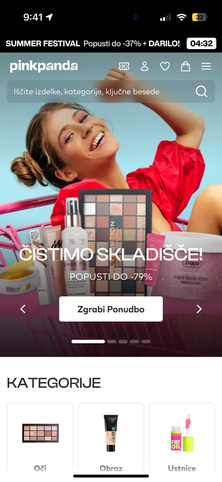
Pinkpanda’s mobile store was a loud stack of banners, timers and badges. The brief was the two pages that do the most work: the home page and the product page, redesigned for mobile first.
Home, before and after
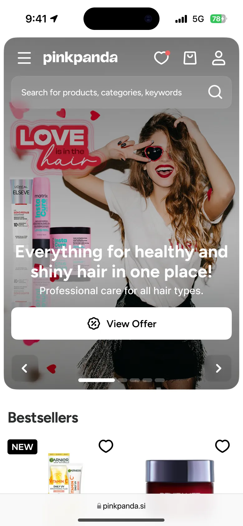
The current home page fights for attention with a sale banner, a countdown and a wall of category tiles. The proposal gives the top of the page to one campaign, puts search right under the logo, and brings bestsellers up where the thumb already is.
Product, before and after
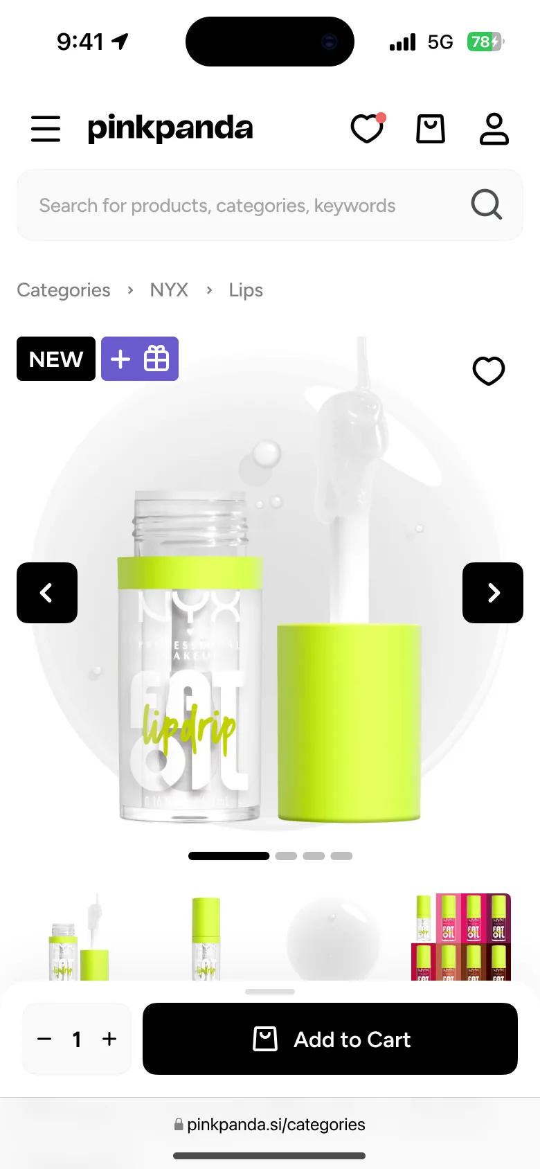
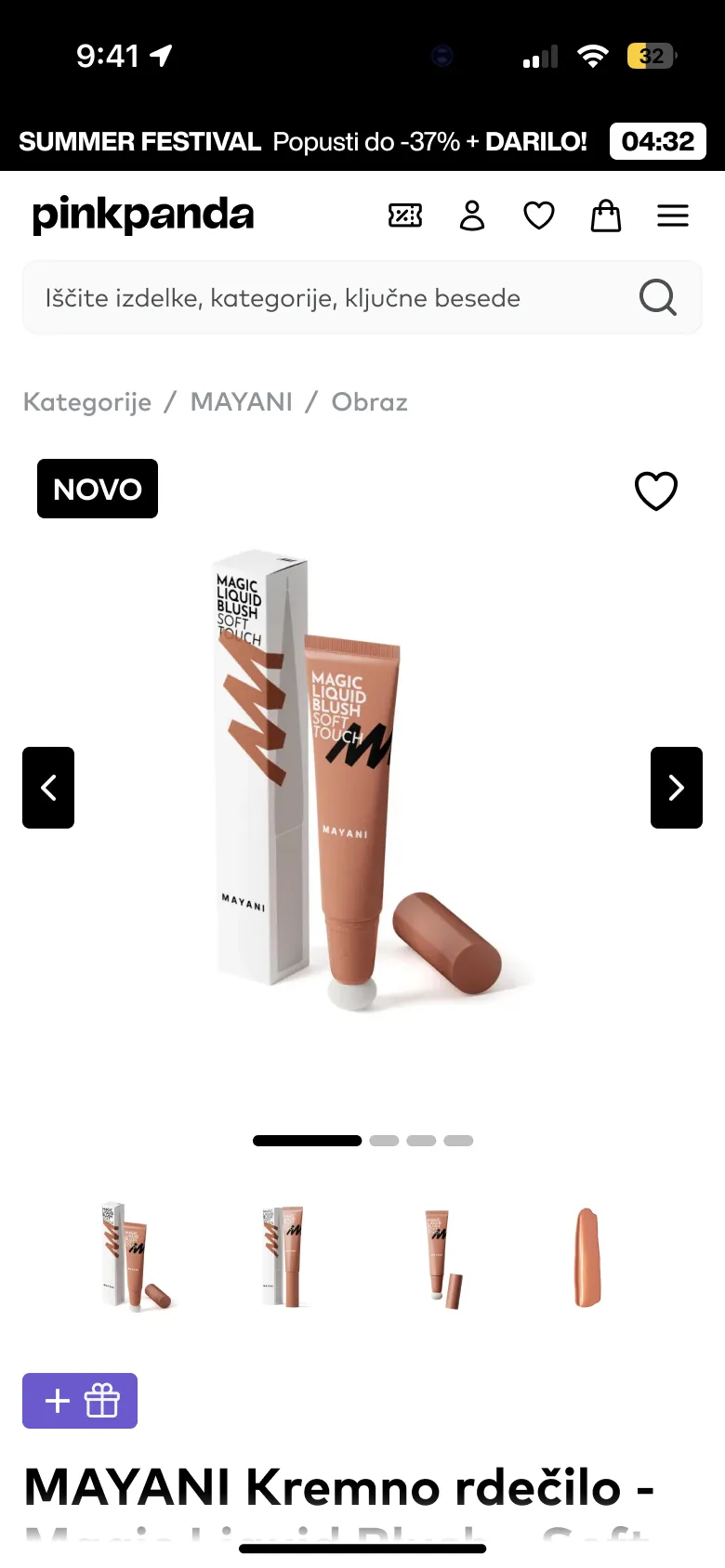
On the product page the photo gets the full width and a clean white stage, the category path sits above it, and the quantity and the add to cart button stay together at the bottom of the screen.
The proposal
- Audit
Current
The live mobile home and product pages, screen by screen.
- Structure
Priorities
One campaign, search and bestsellers first on home; photo, price and cart on product.
- Design
Proposal
Both pages redesigned for mobile.
- Ongoing
Next
The project is in progress.
Takeaways
Fewer things, louder
Giving the top of the screen to one message did more than any badge could.
Keep buying within reach
On a phone the buying controls belong together, near the thumb.