Eese Health: home page
A home page for Eese Health, a probiotic oral care brand, on desktop and mobile.
- Role
- Solo Designer
- Client
- Eese Health Oral care
- Platform
- Web Desktop and mobile
- Page
- Home Full store home page

The brief
Eese makes probiotic toothpaste and oral care that works with the bacteria in your mouth instead of against them. It is a new idea for a toothpaste, so the home page has to explain the science and still feel like a beauty brand you want on your shelf.
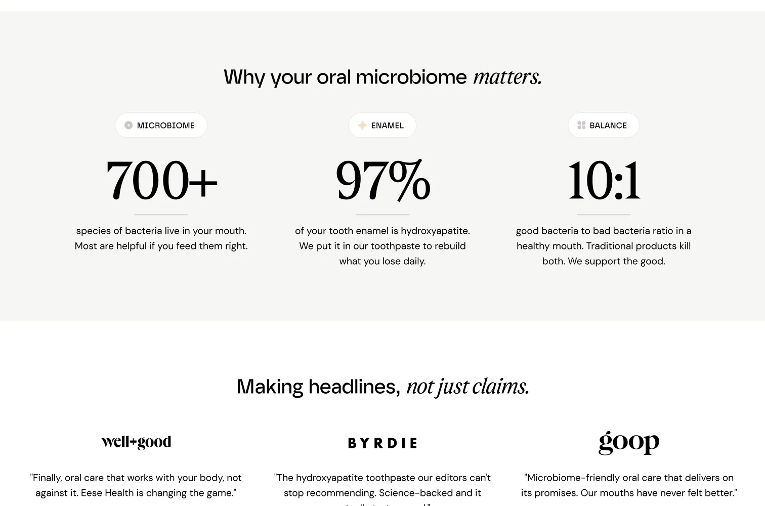
Science that reads like a brand
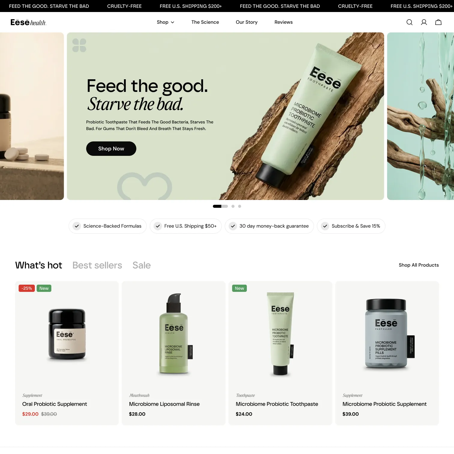
The hero keeps it to one line, “Feed the good. Starve the bad.”, set in a serif over soft sage and wood. The science comes next as three big numbers with one sentence each, followed by press quotes from publications like Well+Good and Goop.
Shopping and proof
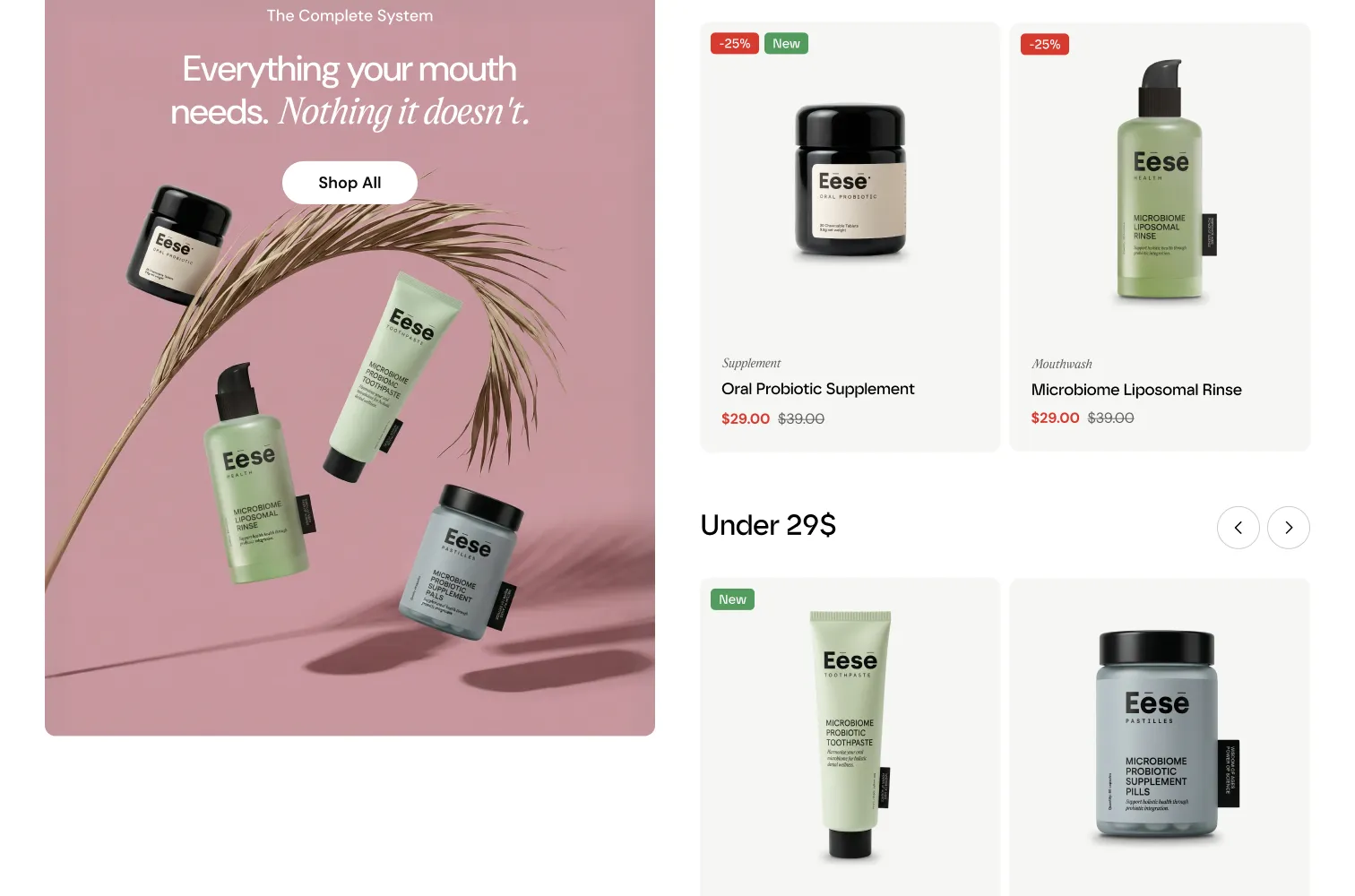
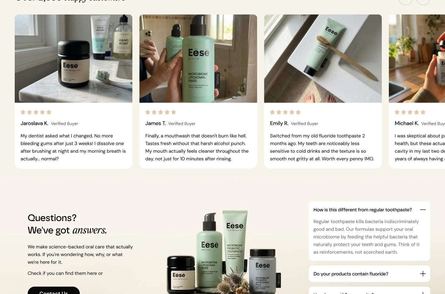
Products get a calm grid with a lifestyle image beside it, then customer reviews with photos, and a short FAQ before the footer.
On the phone
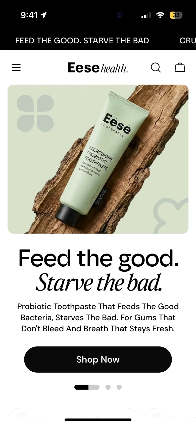
On mobile the hero image comes first, the headline sits right under it, and the shop button is always one scroll away.
- Client
Brief
A new kind of toothpaste that needs explaining.
- Structure
Story
Promise, science, press, products, reviews, questions.
- Brand
Look
Serif headlines, sage and warm neutrals from the packaging.
- Desktop and mobile
Design
The full home page for both breakpoints.
Takeaways
Explain once, then sell
Three numbers did the explaining so the rest of the page could simply show the products.
Health can look good
A science product can still feel warm when the type and colour come from the packaging.