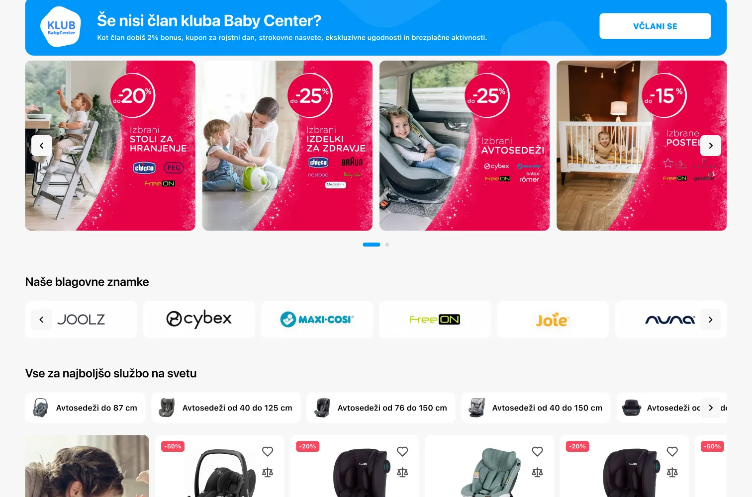
BabyCenter: website
A new website for BabyCenter, a store for babies and young kids, on desktop and mobile. The project is still running.
- Role
- Solo Designer
- Client
- BabyCenter Baby and kids store
- Platform
- Web Desktop and mobile
- Status
- Ongoing In progress

The brief
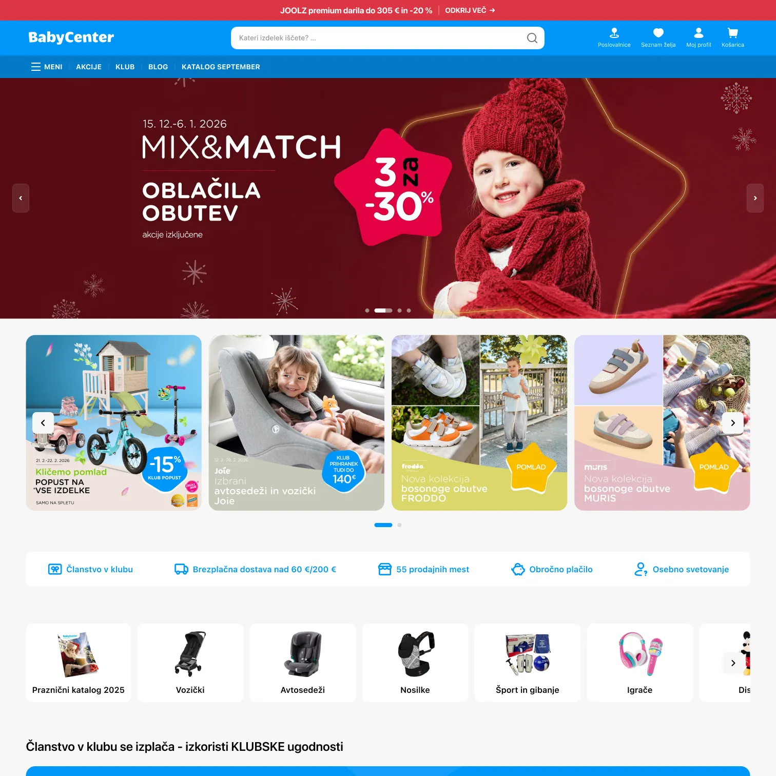
BabyCenter sells everything from car seats and strollers to clothes and toys. The redesign starts with the home page, the one page that has to work for very different shoppers.
One page, many shoppers
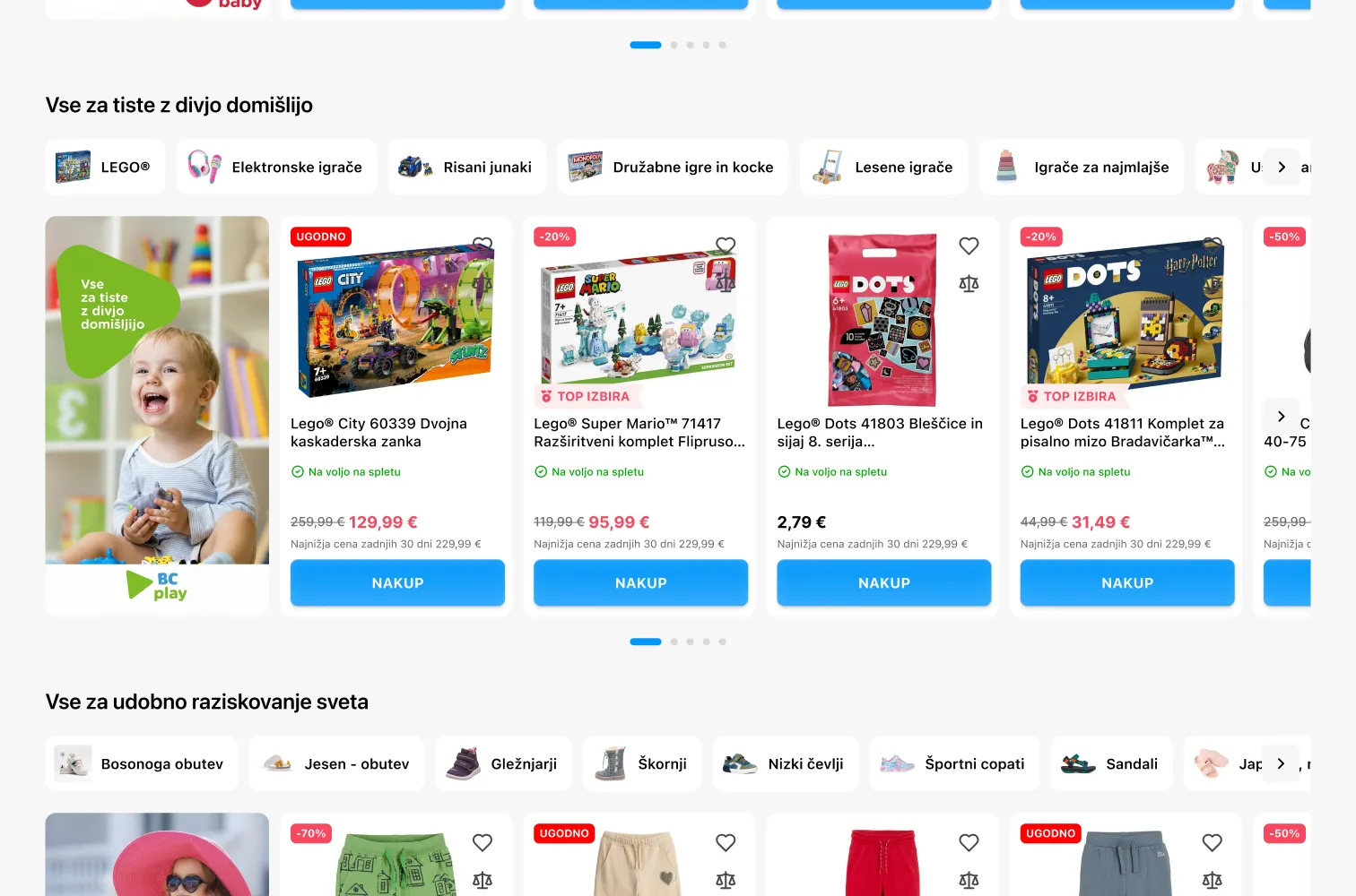
The page opens with the season’s campaign, then turns into a set of short shelves: categories, the club, brands, bestsellers and deals, each with its own clear title. The brand’s blue frames the page, and red marks prices and discounts.
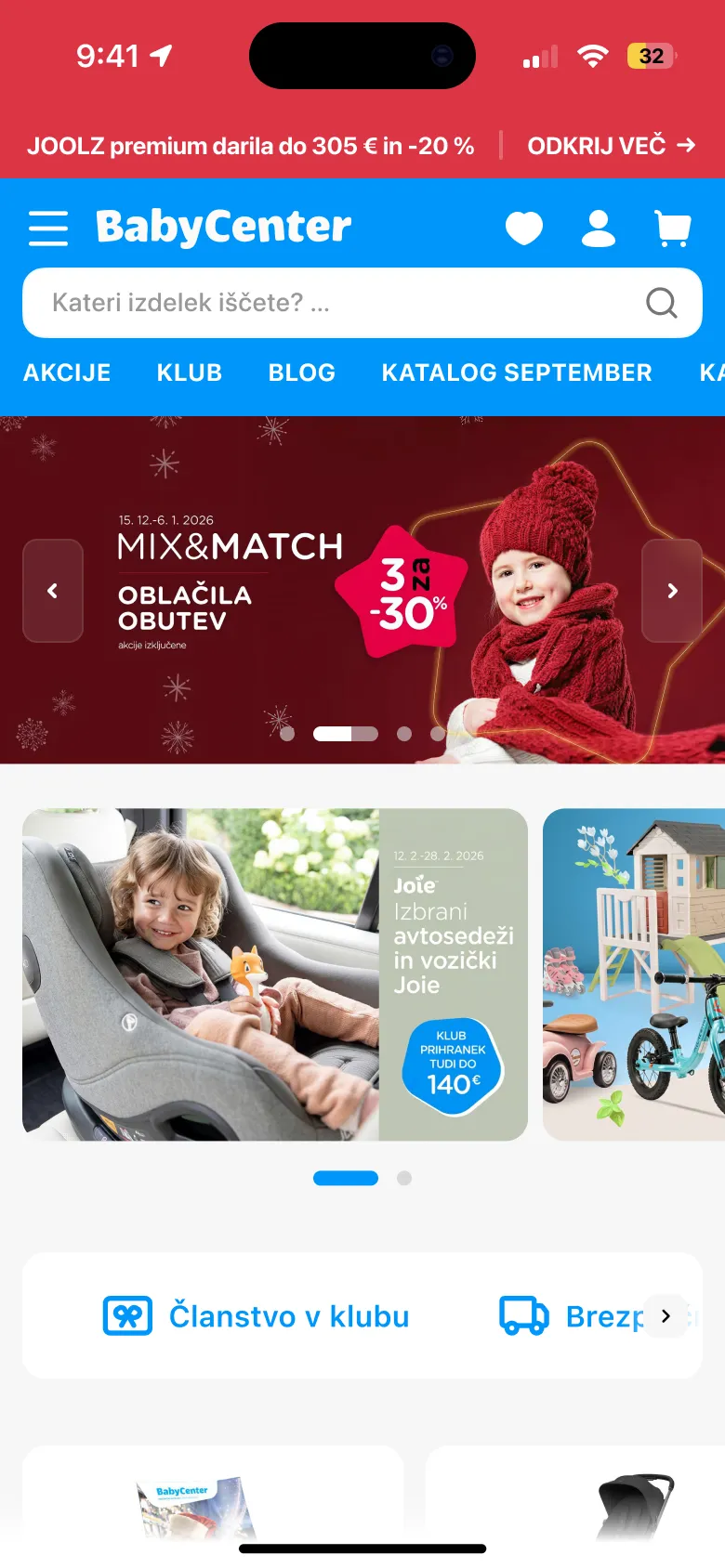
On the phone
On mobile the shelves become horizontal rows you swipe through, and search stays at the top of every screen.
- Client
Brief
A home page for a wide catalogue and very different shoppers.
- Structure
Shelves
Campaign first, then short titled shelves for each way people shop.
- Desktop and mobile
Design
Both breakpoints designed together.
- Ongoing
Next
The project is still running.
Takeaways
Shelves over sections
Short, clearly titled rows let very different shoppers find their part of a big store fast.