Astra AI: marketing website
The 2024 marketing site for Astra AI, an AI tutor later named Slovenia's best startup of 2025. It was live until their recent redesign.
- Role
- Solo Designer
- Year
- 2024 Redesign
- Pages
- 10 Desktop and mobile
- Status
- Shipped Since redesigned

The brief
By 2024 Astra AI was more than one tutor. It had AI tutoring for maths, a library of video explanations, a Matura exam prep product and a set of study resources for schools. The site had to present all of it without turning into a menu of products.
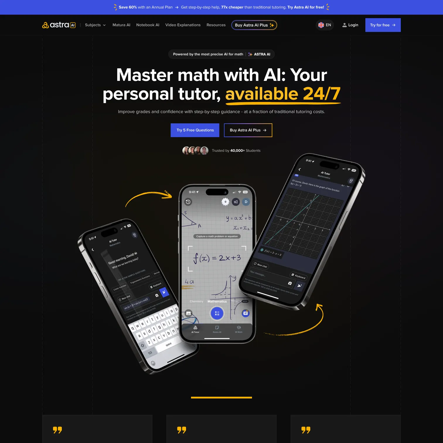
I redesigned the whole marketing site: ten pages, each for desktop and mobile. The dark theme, the blue and the yellow underline carry across every page, so each product still reads as Astra.
A home page that explains itself
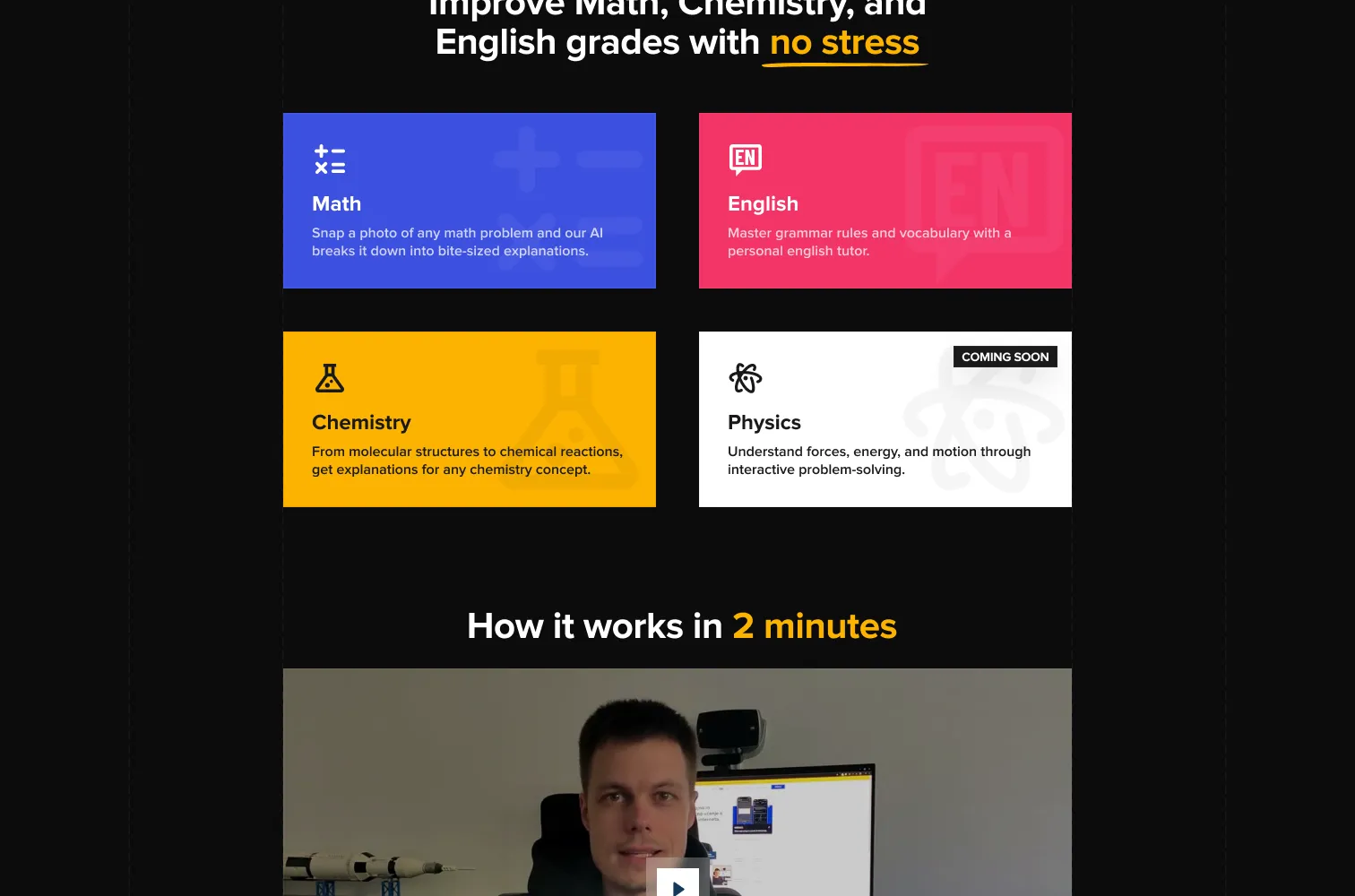
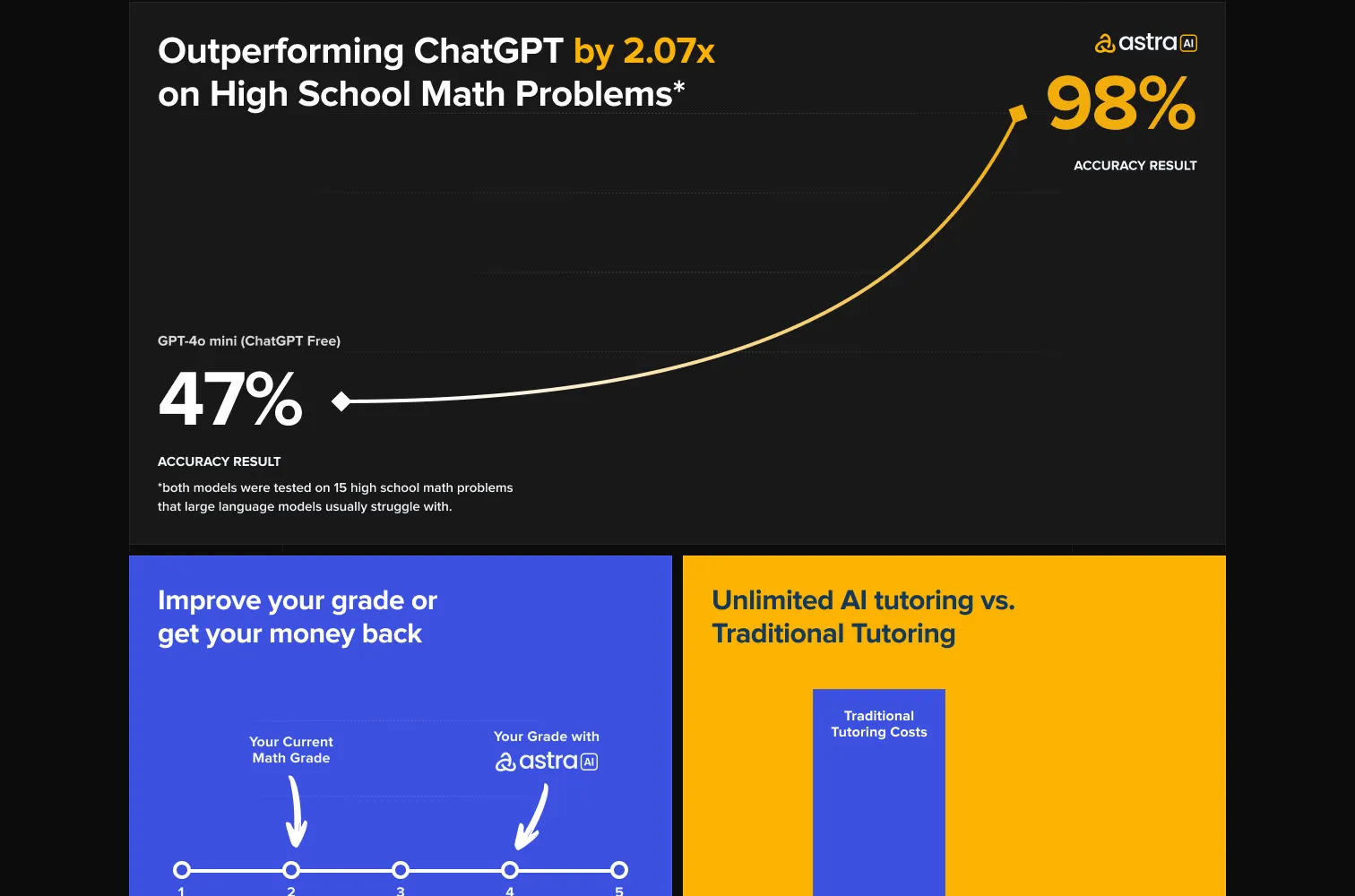
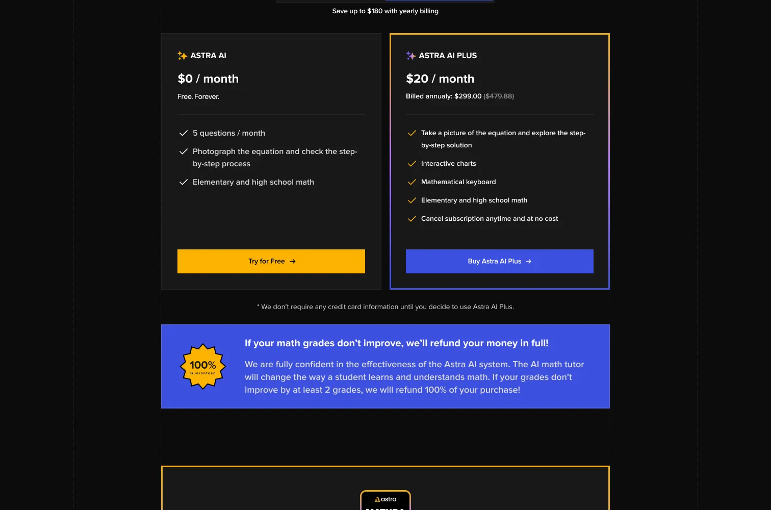
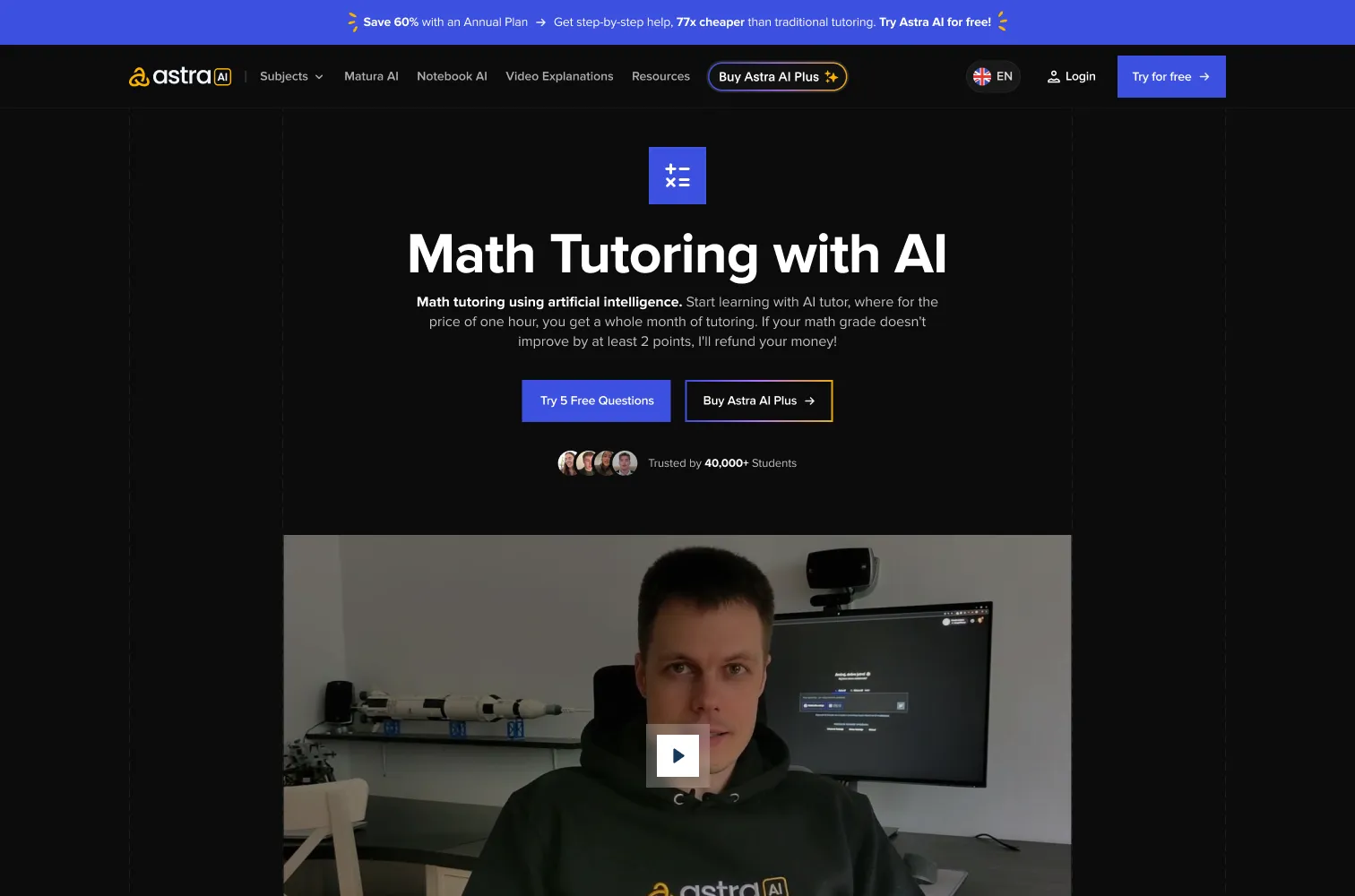
The home page leads with the promise, then shows the product: subjects as coloured cards, a short “how it works” video, and a comparison with ChatGPT on high school maths problems. Pricing sits near the end, with the guarantee right under the plans.
Video explanations, down to one problem
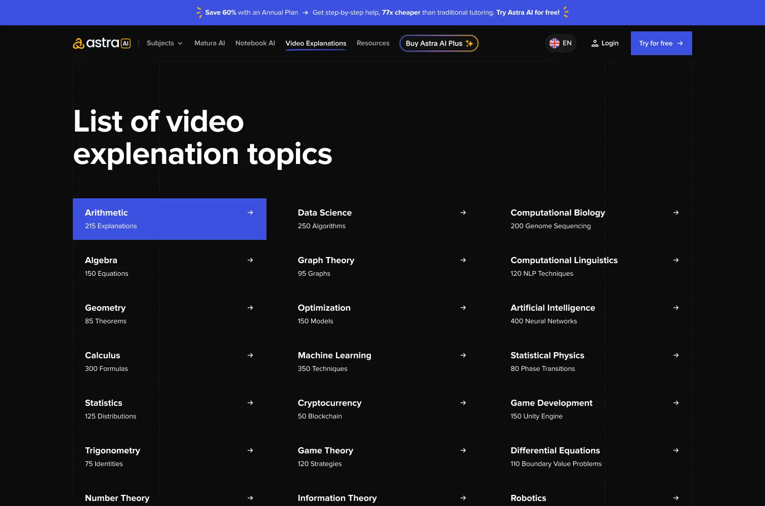
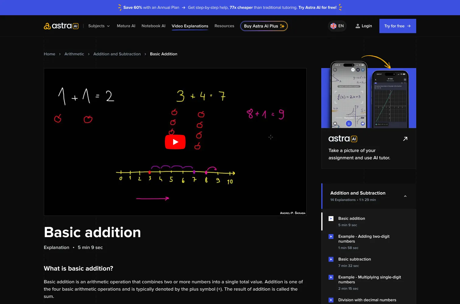
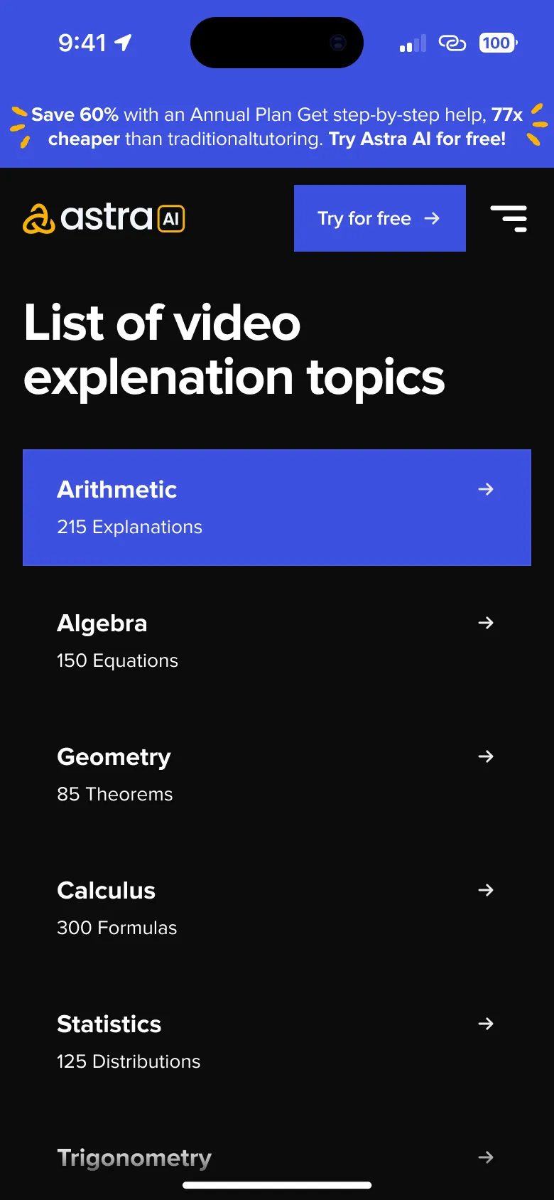
The video library goes four levels deep: all topics, a topic, a chapter, and a single explanation. Each level keeps the same list pattern and breadcrumb, so going from arithmetic to one worked example never feels like a new site.
Subjects, Matura and resources
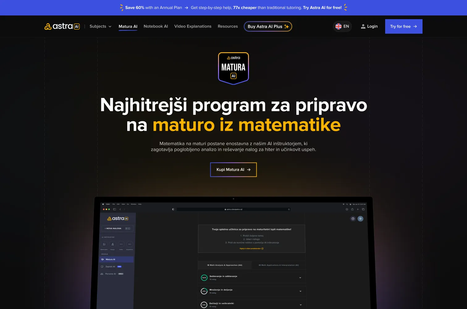
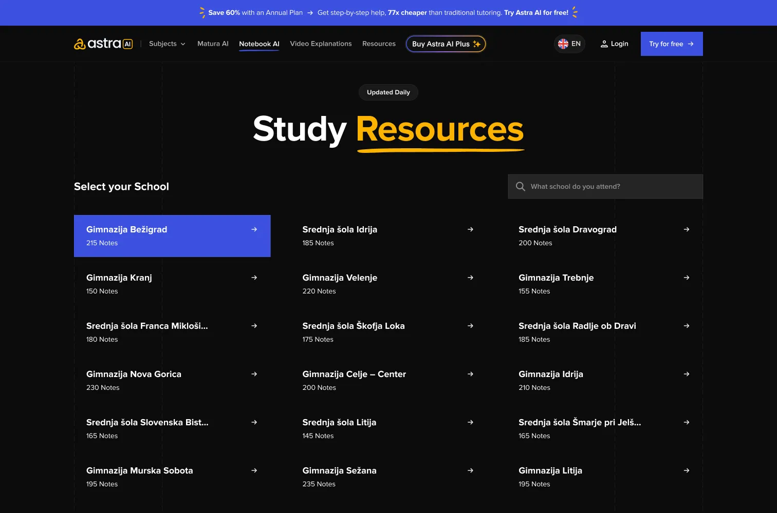
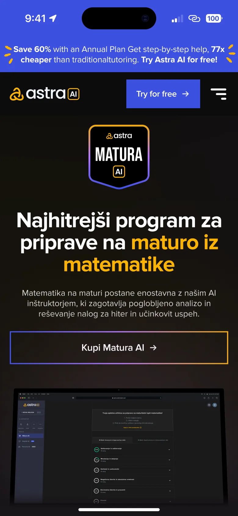
Every product got its own page with the same bones: a clear headline, one main action and the proof under it. Matura AI switches to Slovenian for the students it is for. Resources let a student pick their school and subject.
On the phone
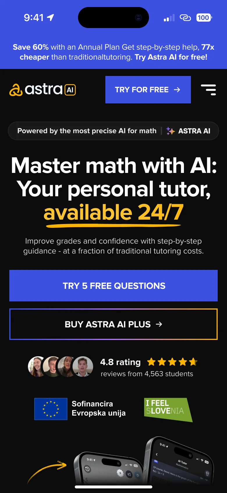
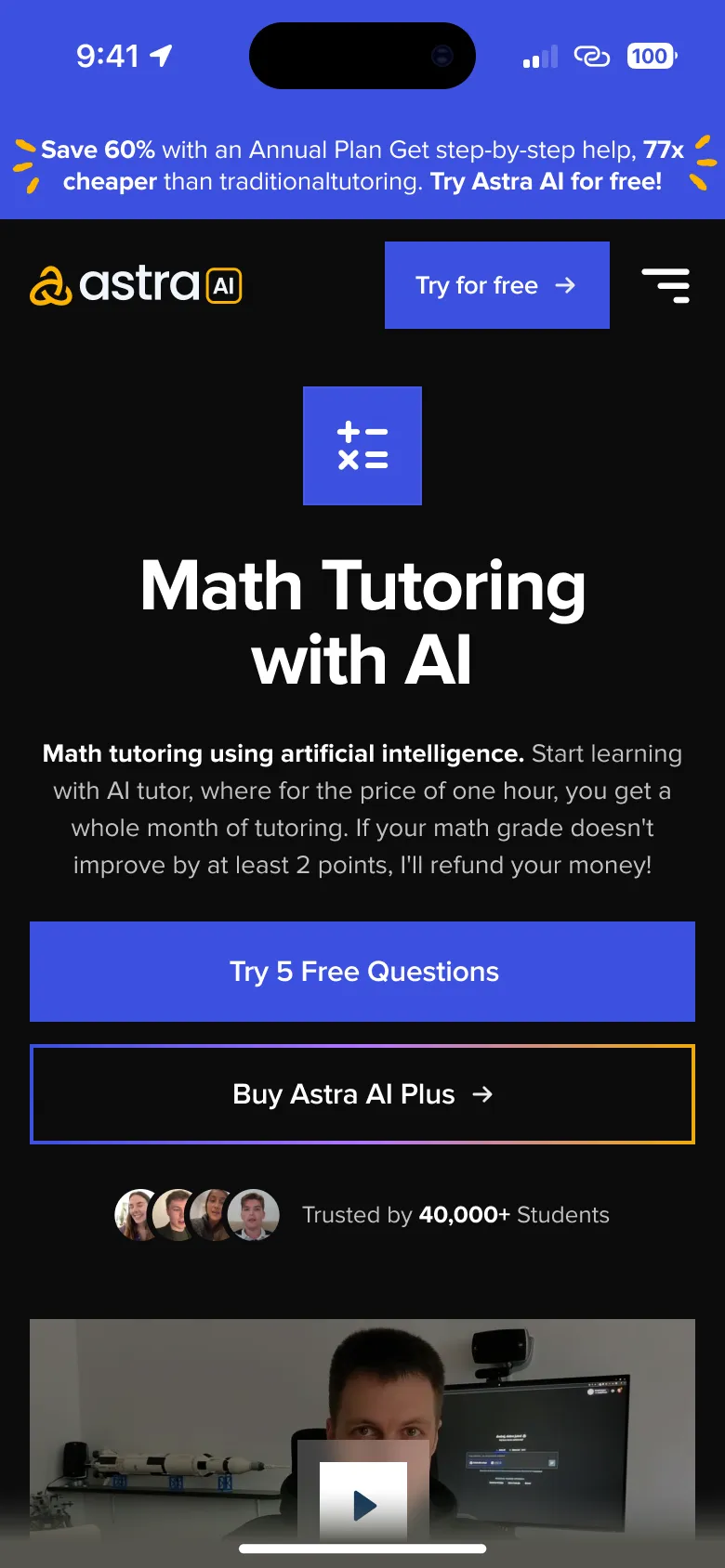
Each page has its own mobile design, not a squeezed desktop. Headlines break shorter, cards stack into one column and the main button stays within reach.
- Structure
Map
Five sections: home, subjects, video explanations, Matura AI and resources.
- Design
Desktop
Ten pages on one system of type, colour and cards.
- Design
Mobile
A mobile design for every page, not an automatic reflow.
- Development
Handoff
Pages approved and marked ready for development, level by level.
- 10
Pages designed, from the home page to a single video explanation.
- 20
Layouts in total, one for desktop and one for mobile per page.
- Live
The site shipped and ran until Astra redesigned it as the product grew.
Takeaways
One system, many products
Giving every product the same page skeleton let the site grow without each new page needing a new design language.
Depth needs a steady pattern
Four levels of video content only stay easy because every level looks and behaves the same.
Design mobile on purpose
A squeezed desktop reads badly on a phone, so every page got its own mobile layout instead of whatever the desktop turned into.